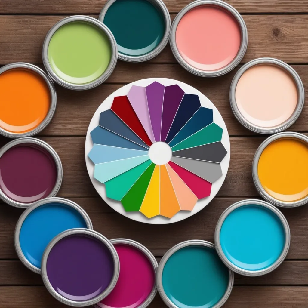
The Psychology Behind Color Choices in Branding
Painting Success: How Colors Speak Louder Than Words

Introduction: A Palette of Emotions
Color is more than a visual treat; it's a silent communicator that evokes emotions, triggers memories, and influences decisions. In the realm of branding, choosing the right colors is not just about aesthetics – it's about understanding the psychology behind each hue.
1. The Language of Colors: What Hues Convey
Red: Bold and Passionate
Consider the reds of Coca-Cola or Target – they signify energy, passion, and urgency. Red grabs attention, making it a powerful choice for brands that want to convey excitement and boldness.
Personal Anecdote: The Red Connection
I once read about a startup that changed its logo from blue to red and experienced a surge in customer engagement. It seems the color switch played a role in making the brand more dynamic and attention-grabbing.
Blue: Trust and Stability
Facebook, IBM, and Samsung have something in common – a calming blue. Blue instills a sense of trust and reliability, making it a go-to choice for brands that want to establish a strong, trustworthy presence.
Personal Anecdote: The Comfort of Blue
A friend shared how she chose a particular bank over others because of its soothing blue logo. The color made her feel secure and confident in the institution's stability.
2. Cultural Influences: Colors Speak Differently Worldwide
White: Purity or Mourning?
While white symbolizes purity in Western cultures, it signifies mourning in parts of Asia. Understanding cultural nuances is crucial – a color that conveys positivity in one culture might have a completely different meaning in another.
Personal Anecdote: The Wedding Dress Dilemma
Attending a multicultural wedding, I observed how the bride chose a red wedding gown, a symbol of good luck in her cultural background, rather than the traditional white.
Yellow: Happiness or Caution?
Yellow radiates joy in many contexts, but it's also associated with caution. Brands need to be mindful of cultural variations to ensure that the intended message aligns with local perceptions.
Personal Anecdote: The Yellow Traffic Light Conundrum
Traveling abroad, I encountered confusion at a yellow traffic light. In some countries, it signals caution, while in others, it's a call to accelerate. It highlighted how a color can be interpreted differently based on cultural context.
3. Building Brand Identity: Consistency is Key
The Power of Consistency
Consistency in color usage builds a strong brand identity. When consumers consistently associate a specific color with a brand, it becomes a subconscious trigger, reinforcing brand recall.
Personal Anecdote: The Starbucks Green
I can't help but think of the vibrant green whenever someone mentions Starbucks. The consistent use of green across its logo and stores has etched the color into my mind as a symbol of the coffee giant.
4. Color Combinations: Crafting Harmonious Palettes
Complementary Colors: Striking a Balance
Successful brands often use complementary colors to create visually appealing and balanced palettes. These combinations enhance the overall aesthetic while maintaining harmony.
Personal Anecdote: The Allure of Apple's Color Harmony
Examining apple products, I noticed the seamless integration of complementary colors. The subtle play between white and metallic tones creates a sense of sophistication and elegance.
Conclusion: A Kaleidoscope of Branding Brilliance
In the world of branding, the psychology of color is a silent force that shapes perceptions, influences decisions, and fosters emotional connections. As brands navigate this vibrant palette, understanding the cultural nuances, embracing consistency, and crafting harmonious combinations are the brushstrokes that paint the canvas of successful branding. So, whether it's the fiery red of passion or the calming blue of trust, the colors chosen tell a story that goes beyond words.


